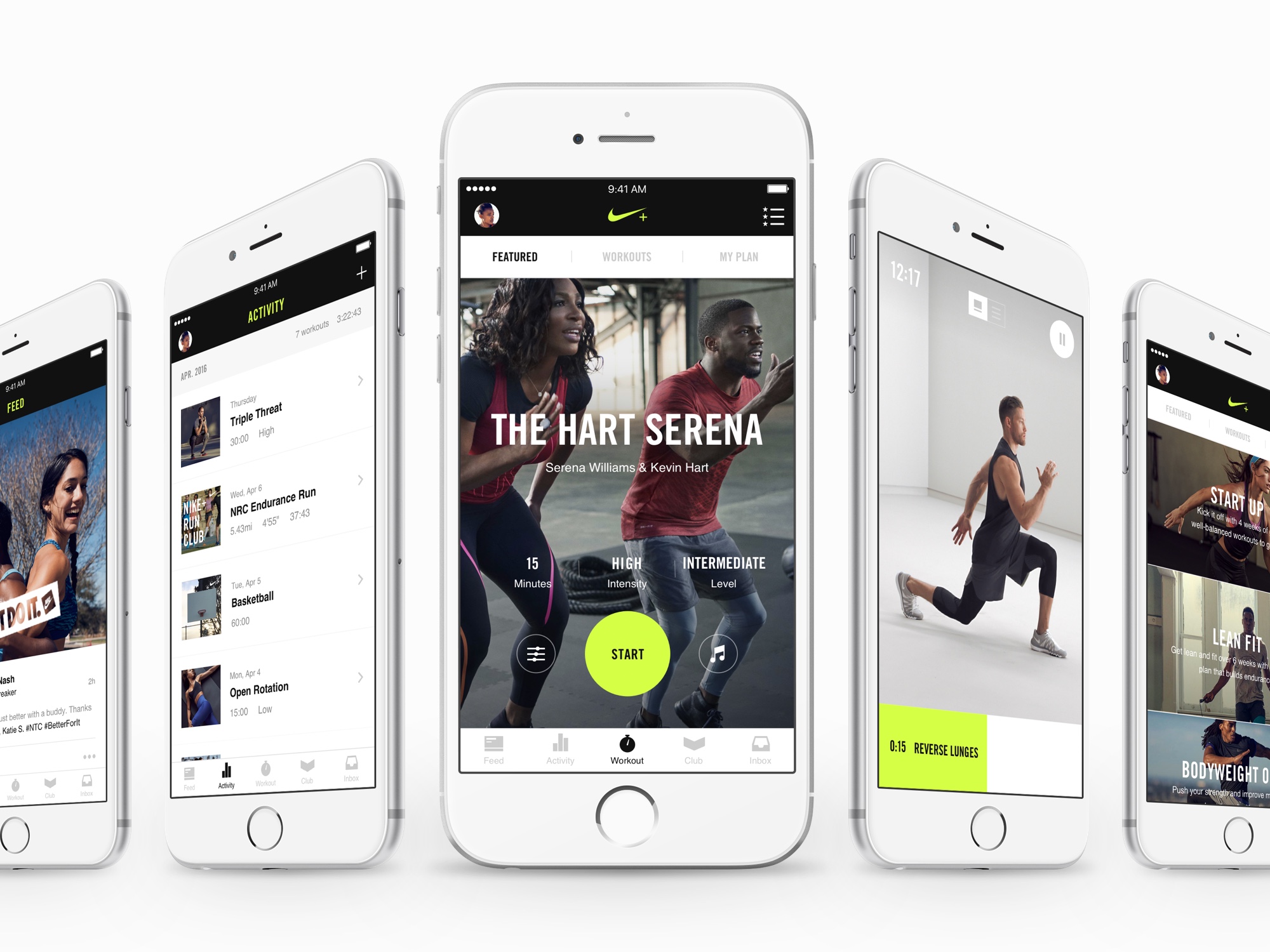
Nike Training Club 5.0
User Experience, Prototyping, User Testing
Nike Training Club 5.0 is the ultimate personal trainer, loaded with over 100+ workouts, available in over 200 countries and available for both iOS and Android.
Your ultimate personal trainer. Get expert guidance, workouts you can do anywhere and the motivation you need to get fit. Including free workouts and personalised training plans, all guided by Nike Master Trainers, our easy-to-follow videos take you through every drill. When you’ve completed a workout, share your progress with friends and the Nike+ community. Google & Apple App stores.
With over 21 million downloads, the new Nike Training Club app has been a wild success. It is available in 19 languages in over 200 countries, and has 1.8 million active users, doing over 500,000 workouts per week.
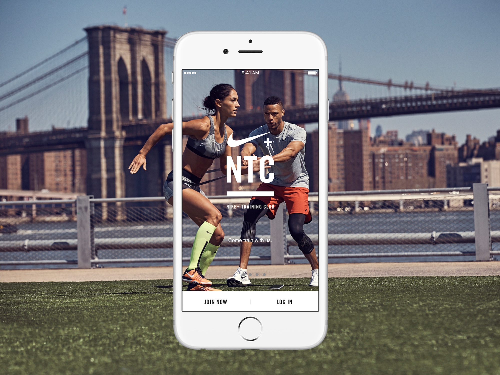
The Brief
Launched in 2010, Nike Training Club for women exploded onto the scene by putting a personal trainer into every pocket. Beyond an app, a movement was born. But with the shift in the training mindset, there was now demand to rebuild from the ground up.
With that in mind, AKQA were tasked with re-engineering the experience for both genders, and aligning with an emerging digital brand ecosystem.
The Tools
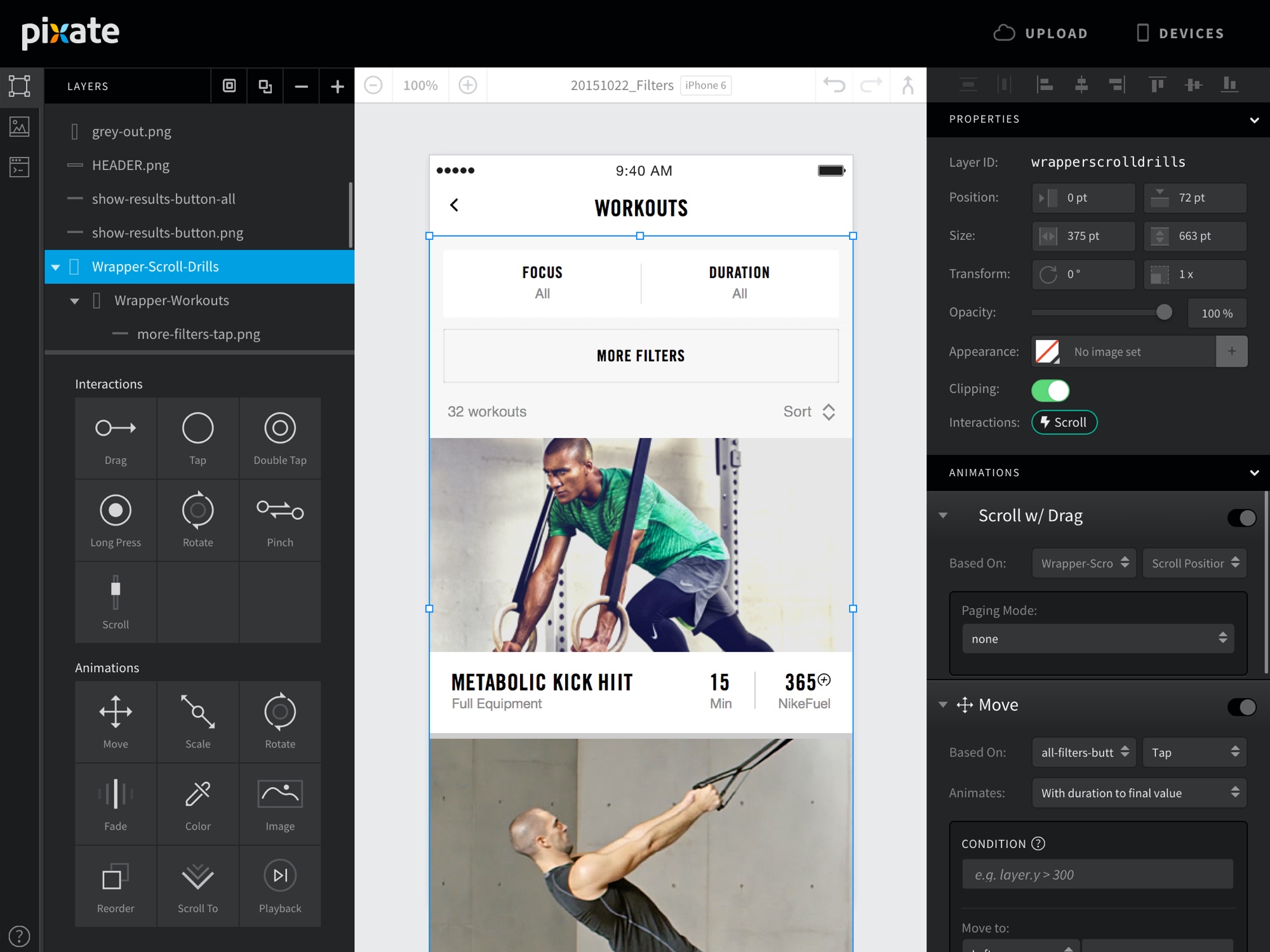
We used both digital and physical to solve problems with the NTC experience. Our main workflow tool go-to was Sketch. We used for everything from wireframing to artworking.
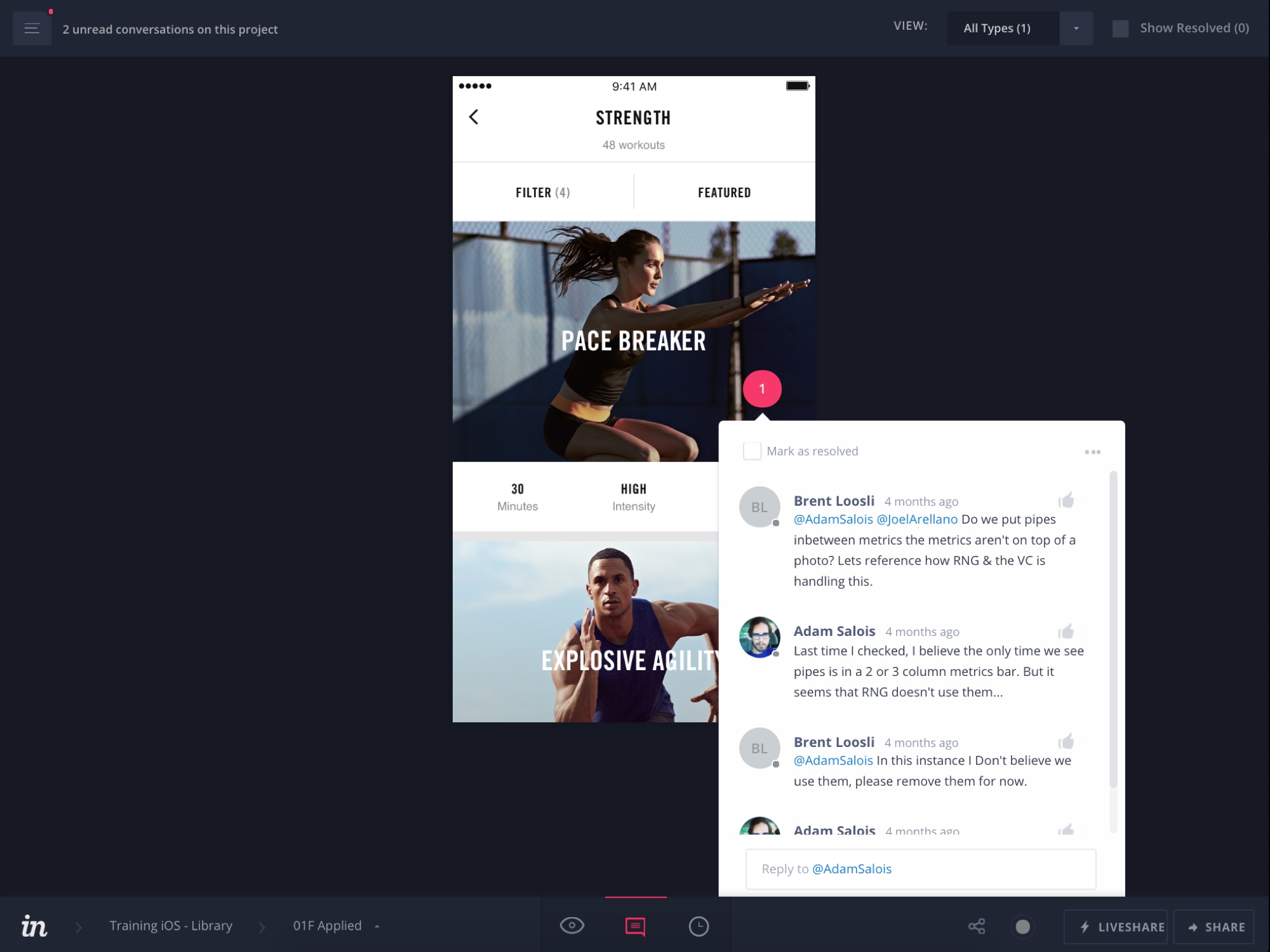
After approving files, we would use Pixate (RIP), or Flinto to construct a prototype to show to the client. Then we would upload our designs to InVision for collaborative feedback. Finally, the files would their long journey in Zeplin, where the developers could get the details of every pixel.
Towards the end of the process, I had the privilege to present the process of how we used tools in designing NTC 5.0 to the Sketch Community. Download the presentation here.
 Your ultimate personal trainer. Get expert guidance, workouts you can do anywhere and the motivation.
The Process
Our process was ever changing. Sketch, guerilla test, design, prototype, refine, repeat. We worked in a lean and agile fashion. We flew to Portland, Oregon to work in the Nike campus with the clients quite often. We grew to understand the training culture that the app was born out of to help us better craft an experience suited to the people who were going to use it. I myself became an avid user of the app, hunting bugs and problems I might have using at home or in the gym.
Greatest App I have ever used. Thanks to this app. I have dropped over 30 LBS in the last 6 months. I have no equipment, but this app doesn’t allow that to be an excuse. Whether you have equipment or not, you can still workout and see results.
— App store reviewer
We built a full-service test lab to mirror gym environments. We began recruitment drives and using prototypes of every fidelity, tested relentlessly, observing natural behaviours to identify problems and their patterns.
The process embraced failure. Starting over with a blank sheet of paper became a sign of progress.
 The gym facility in our AKQA, London office. Set up for user testing observation from a remote room.
Wireframes
We wireframed every screen and every detail in high fidelity. This helped us to see our designs as realistically as possible. Only at the end, after prototyping and approval from the client, would they be sent for artworking. However, even after approval and artworking, we would iterate on the next version. This version may have been with the developers, but we were constantly improving the design patterns and language we had constructed, like it was a living, breathing thing. This influenced and aided many of the future features of the app.
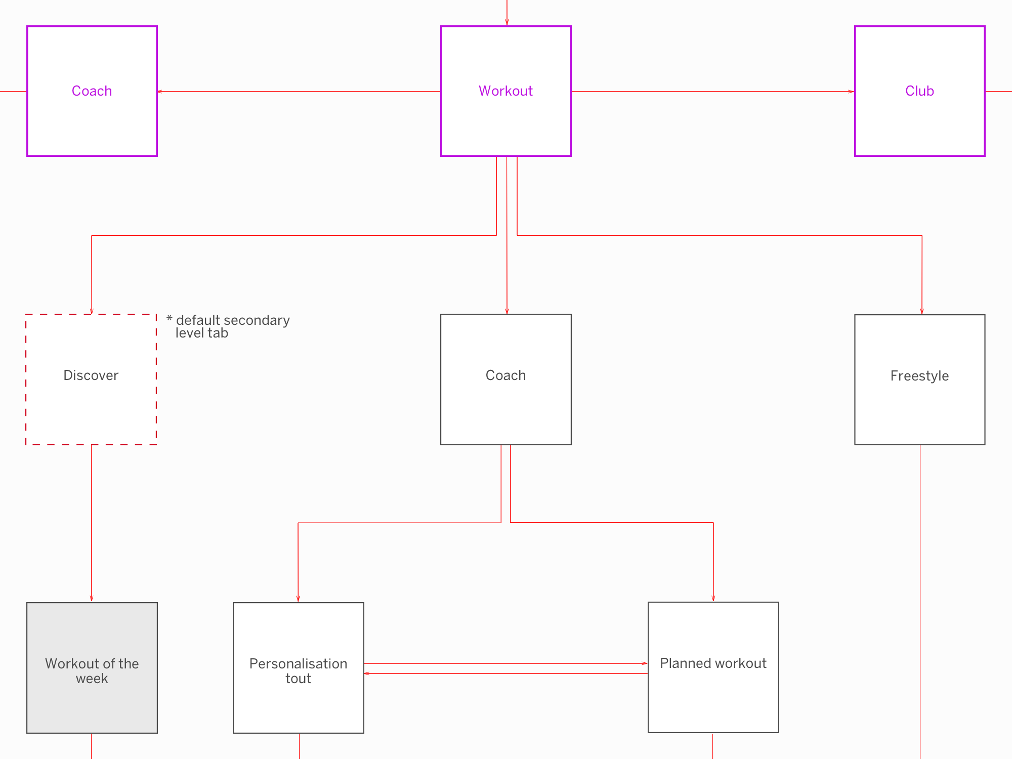 An example design flow route of the ‘In-Session’ experience.
The ‘Workout Plan’
One of the most advanced and consistently refined experiences was ‘The Plan’. This allowed users to create an intelligent system that guided them to workout at specific times of the work, and provided them the most appropriate workout level and time for their preferences.
We developed an adaptive training engine that learns from behaviour. Tell us how hard you pushed and we’ll combine it with personal data, to give you training at the right intensity and focus, next time.
Being such an advanced feature to integrate into an already quite fully-features app, this was on the most complex challenges we had to face.
Eventually after much prototyping and testing, we had come up with a system that allowed users to create a plan suited to their needs and adhered to their fitness goals.
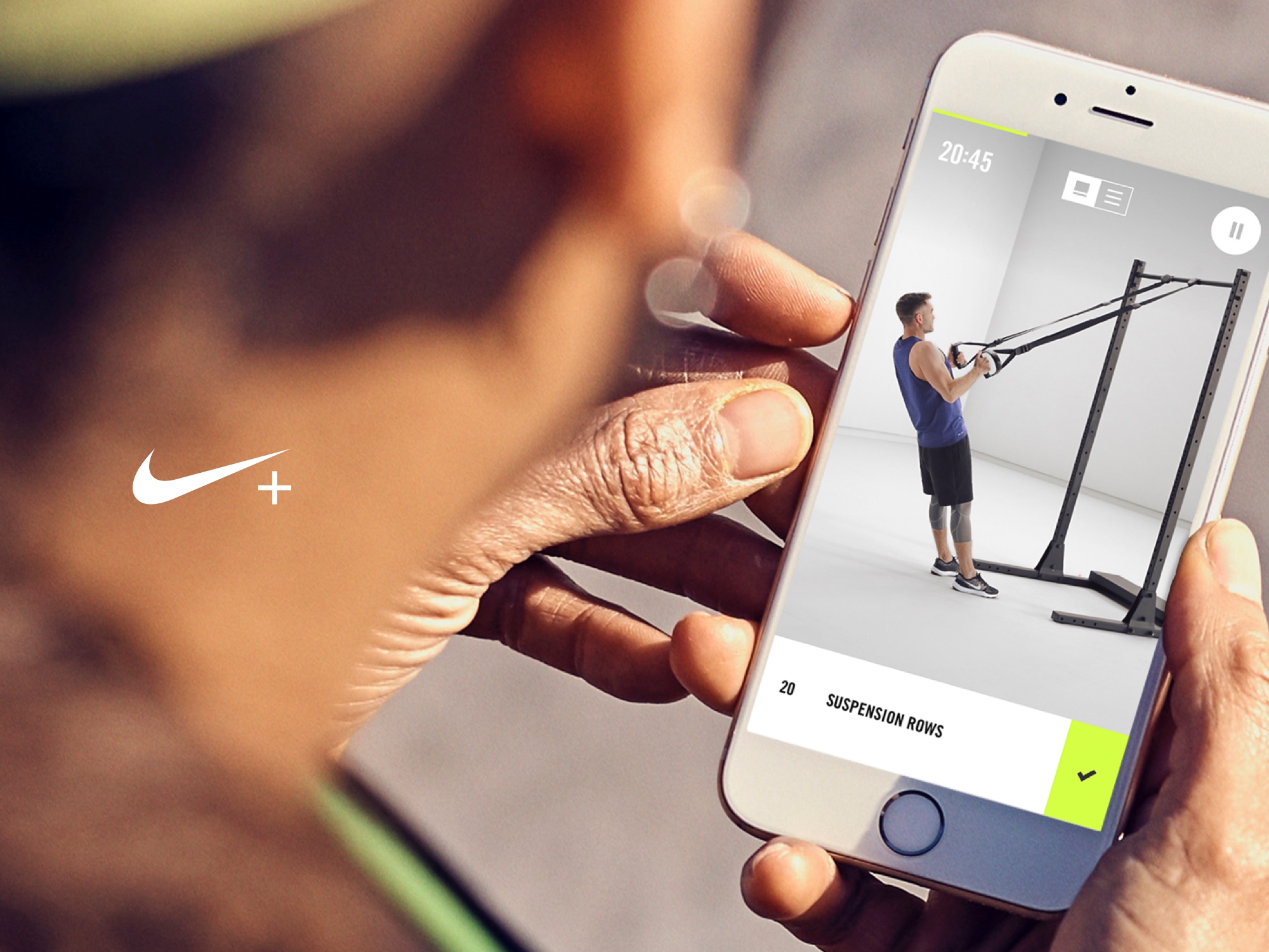
Nike Digital Architecture
After all this refinement and crafting, we had created an experience language that could truly be called Nike. We did all of this work in collaboration with Instrument, another agency in Portland, Oregon. Together we came up with a concept of a unified brand experience language for Nike.
One day soon – This may become a reality.
The ROI
Training is life, not an hour in the gym. The app connects you with experts for advice, recommends product and drops community challenges. All personalised to the user.
With over 21 million downloads, the new Nike Training Club app has been a wild success. It is available in 19 languages in over 200 countries, and has 1.8 million active users, doing over 500,000 workouts per week.
Check out the app on the Google App Store and the Apple App Store and see for yourselves.
